Choosing the right logo type for your brand is one of the most important decisions you’ll make for your business. When people think of a logo, the image they see in their minds is that of a colorful graphic alongside a catchy tagline. That’s an example of a combination, just one of the seven logo types we’ll discuss in this article.
Table of Contents
ToggleWhich logo type is the best choice for your brand?
Although the combination mark is popularly used by digital advertising agencies that offer logo design services to their clients, it doesn’t mean it’s the right one for your business.
Each one of these logo design types has its own set of characteristics and advantages that could be ideal for your type of business.
The 7 Main Logo Types And How To Use Them For Your Brand
1. Wordmark Logos
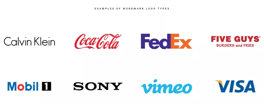
Wordmark logos make use of compelling typography to highlight the catchiness and distinctiveness of a brand’s name. Logo designers focus on font styles that best represent the brand’s value and the nature of the business.
Let’s use Google as a case study.
When we search, we’re like kids exploring a backyard or a playground. Our curiosity acts as our guide and whatever we find is almost always interesting and a “whoa” moment.
That’s why Google’s typography is playful. The Google logo was borne out of an activity we enjoyed doing as kids – doodling – and grew from there. It didn’t matter that the logo went through changes over the years. The logo continued to run with the fun and playful concept.
When to use Wordmark logo type:
- Your brand name is short, catchy, distinct, and has the potential of staying top-of-mind;
- You’re starting a new business and you want to shine the spotlight on your brand name.
If your brand name is too long, using the wordmark design style might not work because the logo will look disorganized and hard for the audience to decipher.
2. Monogram or Lettermark Logos
Monogram or lettermark logos are stylish renditions of a brand name in an acronym format.
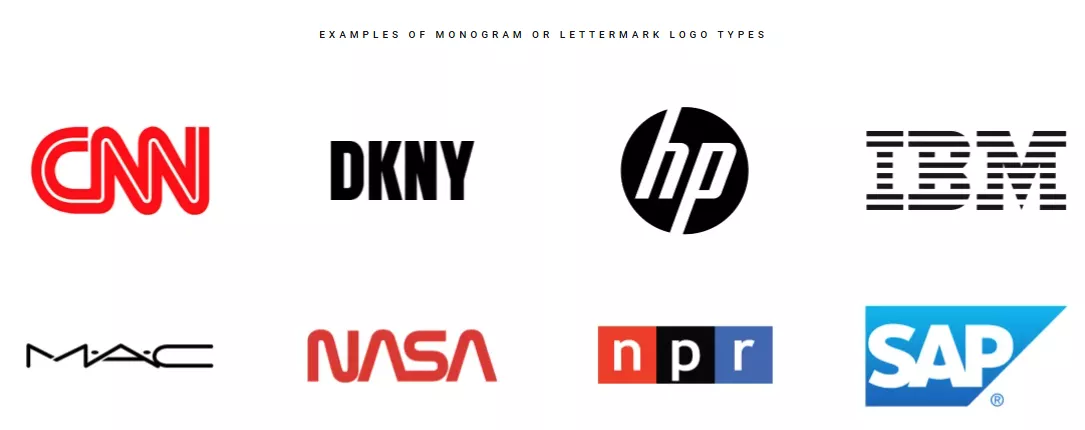 By abbreviating the business name into just 2-3 initials, it makes the brand easily identifiable to its audience.
When to use Monogram or Lettermark logo type:
- Your business name is long or uses multiple words;
- Your marketing strategy includes the distribution of printed marketing materials.
While it’s a good idea to abbreviate long business names, if yours has more than 5 words, that means the monogram logo will have at least 5 letters. It might not be as memorable as 3-letter monogram logos.
3. Symbol or Pictorial Mark Logos
The symbol or pictorial mark logos is a purely graphic or image-based design style.
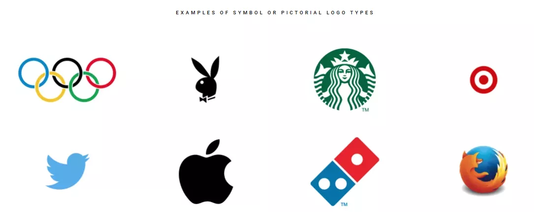 You might be thinking “Wow! The people who came up with these logos are geniuses because every time I see the logo, the brand comes to mind.”
The truth is, the pictorial mark logos of the brands mentioned above became memorable because the businesses achieved and sustained long-term success.
Every time you visit a Starbucks, the mermaid symbol greets you at the door, welcomes you into the cashier’s line, and is printed on mugs, paper cups, napkins, and all of the coffee chain’s products.
Starbucks’ mermaid symbol has become part of pop culture much like the logos of Playboy and Apple.
Likewise, coming up with the right symbol can be a tricky proposition. You want to use a symbol that the customer can relate your business with. For example, Twitter’s bird symbol is associated with the act of “tweeting” short messages.
When to use symbol or pictorial mark logo type:
- You’re confident that your brand is established in the industry;
- You’ve picked out a graphic or image that best represents what your brand is about;
- You’re marketing your products to a global market and the brand name is too long to translate.
If you’re uncertain about your business model or the type of enterprise that you’re currently into, conceptualizing a singular graphic or symbol for your brand might not be a good idea.
Imagine a chain of hamburger stores that decided to close up and shift to real estate property development. Prospective buyers will be wondering what a burger and fries graphic has to do with the real estate business.
4. Combination Logos
The combination logo combines elements of a wordmark or monogram with a pictorial mark, an emblem, an abstract, or a mascot. The last 3 logo types will be discussed after this section.
This type of logo features a graphic or an image with text. Each component has a standout trait and what the designer wants to do is have these traits complement one another.
The goal is to combine these elements to create a captivating logo that can be viewed as the singular image for the brand.
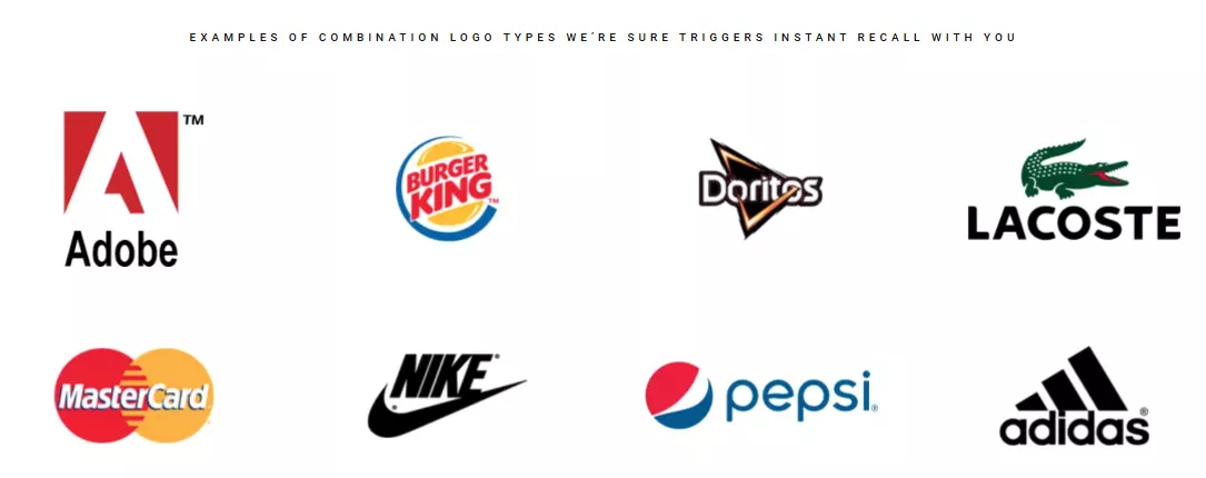 The reason why the combination logo type is a popular choice with logo designers is that it allows the graphic and typography to complement each other’s strengths and reinforce the value of the brand. Customers will associate the graphic with the text and vice-versa.
Over time and with consistent business success, the graphic or the pictorial mark by itself can represent the brand.
Look at Nike. We’ve grown familiar with the Swoosh logo and the tagline “Just Do It” below it. The combination of the Swoosh graphic and the tagline has become so successful that whether we see one or the other, we know it’s Nike.
When to use combination logo type:
- You’re confident about the strength of your graphic, image, abstract, emblem, or mascot and the wordmark or lettermark of your brand;
- You’re planning to distribute collaterals as part of your marketing strategy;
- You’re a start-up.
Or if you’ve been in business for a while.
Our point is that the combination logo is a versatile type of design that can help just about any business achieves its branding objective.
5. Emblem Logos
The emblem logo features typography situated within a graphic with borders such as a crest, a seal, or a badge.
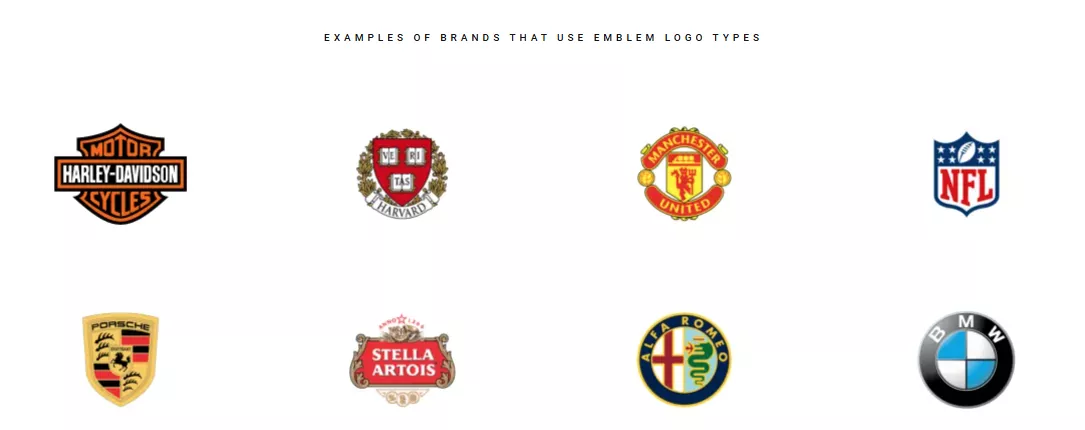 Emblem logos tend to be more sophisticated in appearance because greater detail is needed to intertwine the graphic and the text. For this reason, if you decide to use an emblem logo for your brand, you should hire an experienced logo designer.
When to use emblem logo type:
- Your business is part of a hallowed institution such as education, healthcare, and public service where trust and transparency are paramount core values;
- You believe that in the long term, your business can establish its legacy within the industry;
- You plan to promote your business by distributing marketing giveaways such as pins, caps, mugs, and t-shirts where the printing areas are limited.
An emblem logo isn’t ideal for a business that is unsure or uncommitted to its long-term growth prospects. Also, an emblem logo with its intricate design, might not appear visible on a business card.
6. Abstract Logo Marks
An abstract logo is a pictorial mark that requires a bit of analysis from viewers. Truthfully, the abstract logo is a more accurate representation of a symbol than a pictorial mark because the intent of the graphic is to capture all the elements that best represent what the brand is about in one image.
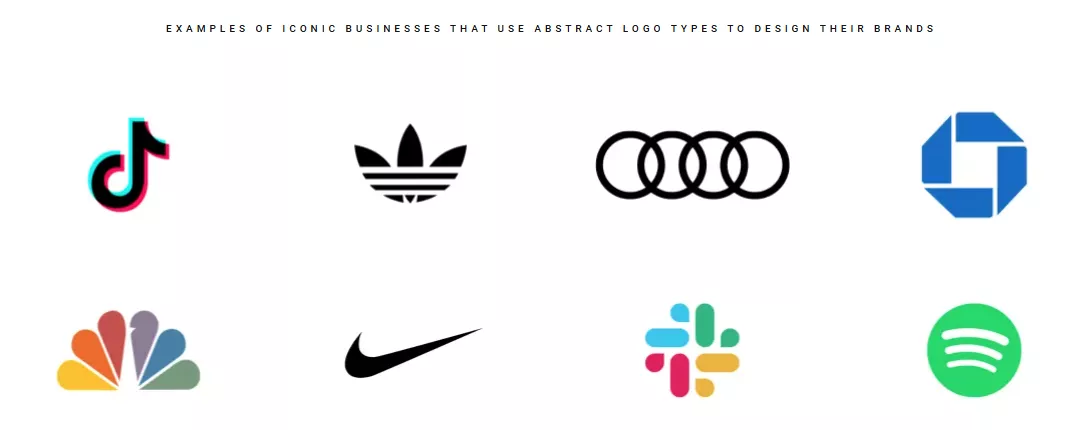 To create an effective abstract logo, you must know the story behind the brand, identify the defining characteristics of the business, align the information with its BVP, and design a graphic that successfully sells the narrative to the audience.
When to use abstract logo type:
- You’re managing a business that has been operating successfully for years;
- Your business is targeting buyers from international locations.
The abstract logo isn’t recommended for start-ups because the lack of a track record or a solid reputation in the industry will make it hard for people to establish the relevance of the symbol with your business.
Did you notice that Starbucks was categorized both as an abstract and a symbol or pictorial mark logo?
In the case of Starbucks, the graphic is abstract; it’s the coffee chain’s roundabout way of referencing the coffee sea trade. “Starbucks” is a main character in the classic sea adventure “Moby Dick”.
But Starbucks has grown immensely popular over the years and the abstract logo is immediately associated with the brand. Thus, it has become a symbol for the coffee chain.
7. Mascot Logos
Mascot logos involve the use of an illustrated character that is often colorful, cartoonish in appearance, and perceived as “fun”.
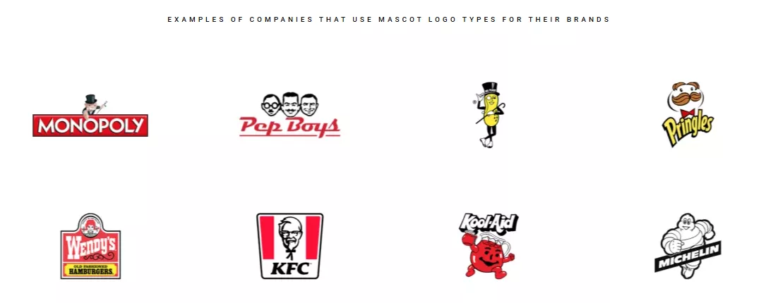 When to use mascot logo type:
- Your business targets kids or families with young children;
- Social media marketing is one of your primary digital marketing strategies;
- Your business has its own mascot.
A mascot logo might not appear clearly on marketing materials for distribution and business cards.
Frequently Asked Questions (FAQs)
1. What is the purpose of a logo?
The logo is a graphic representation of your business and what it represents. Its purpose is to communicate the identity of your brand – its Brand Value Proposition (BVP) or what makes your business unique, special, and valuable – to your target market.
2. How do I choose the right logo type for my brand?
- Define what your brand is all about and identify the characteristics and behaviors of consumers who are most inclined to patronize your products.
- Create your BVP – what qualities make your brand the best option for your target market?
- Come out with logo design drafts and run mockups using the seven logo types discussed here.
- Perform beta-testing of the logo designs with your audience and find out which one receives the highest scores.
3. Can I choose a premade logo template?
You want your logo to be unique to your business brand. Using a premade logo template means other businesses could have logos similar to yours. It’s always better to come up with an original logo design for your business and hire professional logo design services.
4. Should my logo include a tagline?
Taglines are usually added to emphasize the BVP, trigger specific emotions or highlight business philosophy. For these reasons, you can find taglines in print ads and select web pages.
But if you have a professionally designed, well-conceptualized logo with the right design elements to convey your BVP, you won’t need a tagline.
5. How can I make my logo stand out from competitors?
- Be original. Come up with characters, symbols, or images that are unique to your brand.
- Use eye-catching, non-traditional font styles.
- Apply color psychology in design. Colors are often associated with industries and can trigger desired behaviors. For example, the color green is perceived as fresh or eco-friendly and can be the right choice for health food businesses.
- The choice of the graphic must be relevant to the nature of the business and resonate with the target buyers.
6. What file formats should I have for my logo?
The best file formats for your logo are AI (Illustrator), EPS, JPG, WebP, SVG, and PNG.
Conclusion: The Timeless Impact Of A Well-Designed Logo
When it comes to brand-building, you want to start on the right foot. This means designing a logo that can effectively communicate your BVP to potential customers.
Thus, the best approach would be to outsource this task to an agency that’s qualified to provide logo design in the Philippines.
The agency can perform a professional assessment of your business, conduct the necessary research, and ultimately give you the best advice on which of the seven logo types is the best for your brand.
Also, by capitalizing on the agency’s knowledge and experience, you can reduce the risk of making costly mistakes that could set back your brand-building efforts.
Having a well-designed logo for your business will get your brand successfully entrenched in the market and the consciousness of your target audience.
Who knows? As your business grows over the next few years, your logo might be mentioned alongside the most iconic brands; the classics that have endured the test of time.
Roel Manarang is a seasoned entrepreneur who helps businesses succeed through design and digital marketing. With over 10 years of experience, he has assisted 170+ global companies. Roel is the founder of Workroom, a digital marketing company, and Tycoon Philippines, an acclaimed business and finance blog. Find him on LinkedIn.
